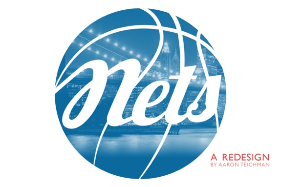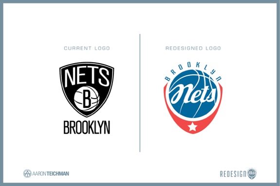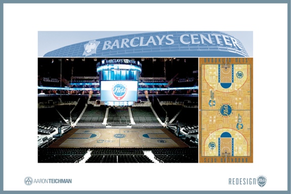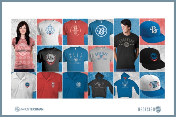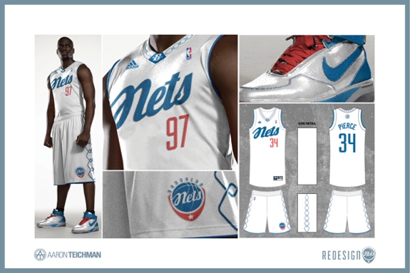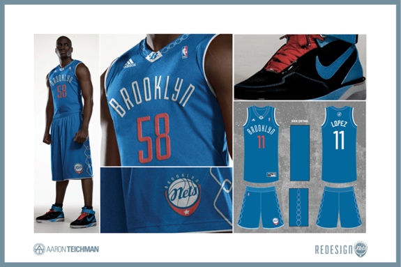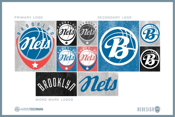
“I am really not a fan of the current Brooklyn Nets logo so I decided to create my own Nets logo. After seeing other redesigns, most of the designs are tributes to the Brooklyn Dodgers and they are designed in black and white. So I created a logo in color and I did like the idea of creating a Nets logo that is a tribute to the Brooklyn Dodgers. I wanted to create the design to be a tribute to the Dodgers but not copy it. The only tribute to the Brooklyn Dodgers that I directly took was the clubs colors. I also wanted to incorporate a net design because the teams nickname is the “Nets” and I feel the team has gotten away from that in their recent designs. Though a tribute to the Dodgers, I gave it a modern design. This is most evident in the Nets uniforms which follows the trend of minimalist design in the NBA.” – Aaron Teichman, Oviedo, FL, USA