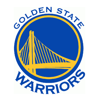
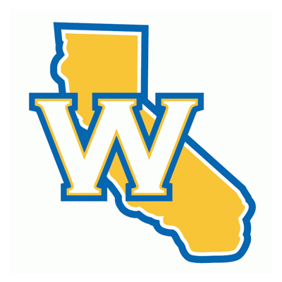
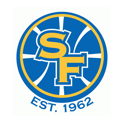
Golden State unveiled their new old school looking logo and court during their draft party for about 4,000 fans last night and I bet the people who were in attendance felt like they took a trip in a time machine with new school beer prices.
That being said, I’m digging the new direction GS went with their branding because the lighting bolt guy logo kinda felt expansiony and that’s a bad thing for a club that has been around since 1962. I’m just sayin’.
After the jump, check out the new and secondary Warriors logos that promises increased merchandising sales and Golden State wins — okay fine, I just made up that last part.
H/N Chris Creamer
