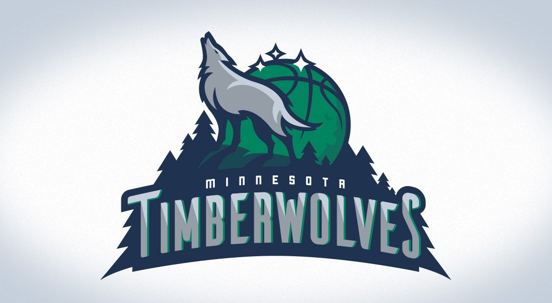
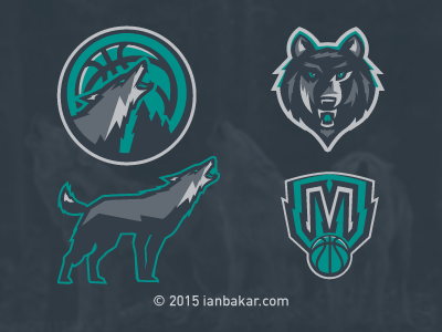
The current ‘Wolves branding is a slight fixer-upper of a logo that was originally introduced in 1996. As of late, their aesthetic has gone from a nice mix of green and blue, to looking more and more like the Orlando Magic (especially with their two primarily used wolf-head and howling wolf logos) and in their uniforms, utilizing only black, blue and silver. The current trees look like legos, and the yellow in the eyes are garish.
The NBA has an overabundance of blue, and unique color schemes are few and far between.
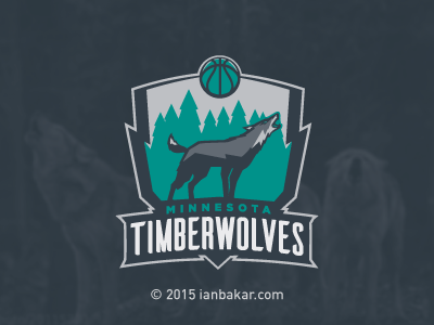
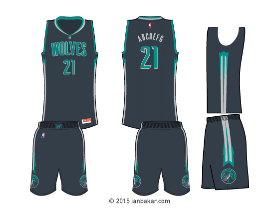
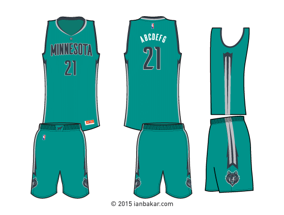
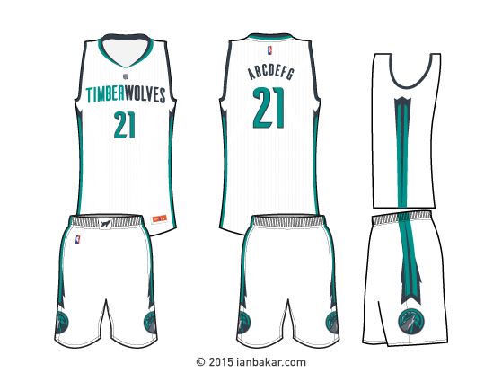
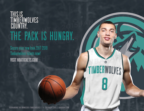
With such a unique name, that suits the area so well, the Wolves owe it to themselves to have a stand-out and cohesive brand.
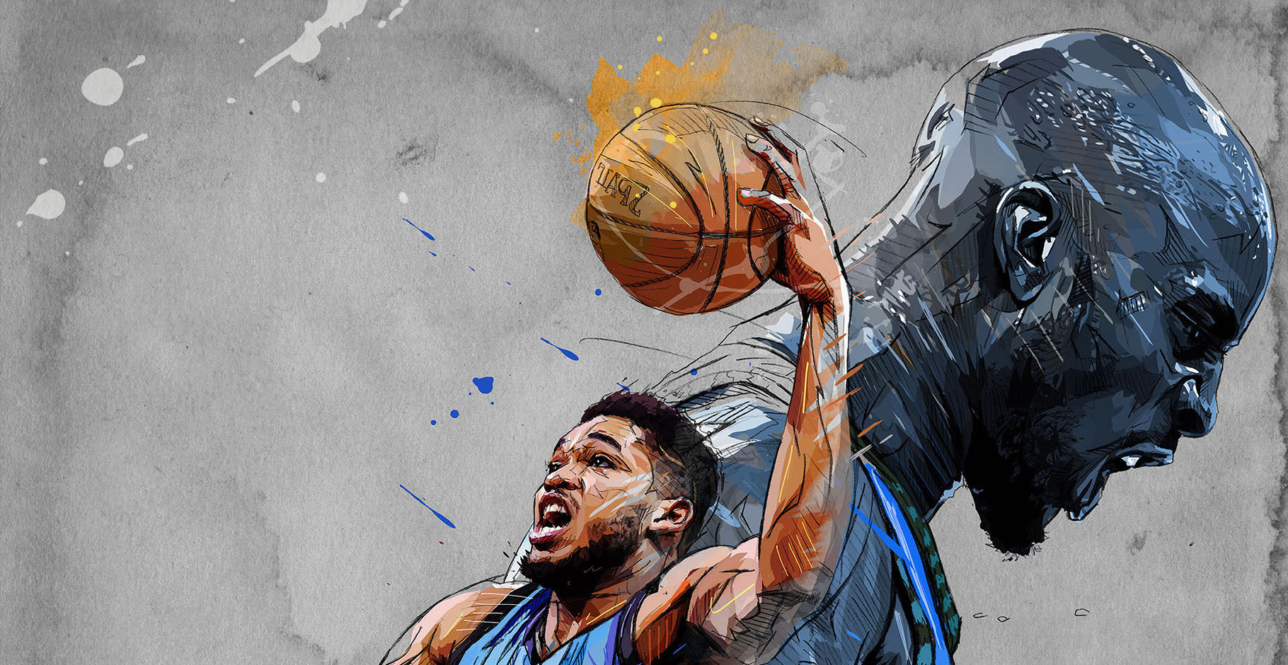
With a young, fresh, unique and star-studded line up including the likes of Karl Anthony-Towns, Andrew Wiggins, Ricky Rubio and Zach LaVine, the Wolves need a brand that reflects this new energy.
Words and art by Ian Bakar